Category Archives: Analisa Teknikal

John Murphy’s Ten Laws of Technical Trading

StockCharts.com’s Chief Technical Analyst, John Murphy, is a very popular author, columnist, and speaker on the subject of Technical Analysis. John’s “Ten Laws of Technical Trading” is the best guide available anywhere for people who are new to the field of charting. I urge you to print out this page and refer to it often. If you find this information useful, consider subscribing to StockCharts.com which will allow you to read John’s latest market commentary.

Which way is the market moving? How far up or down will it go? And when will it go the other way? These are the basic concerns of the technical analyst. Behind the charts and graphs and mathematical formulas used to analyze market trends are some basic concepts that apply to most of the theories employed by today’s technical analysts.

John Murphy, StockCharts.com’s Chief Technical Analyst, has drawn upon his thirty years of experience in the field to develop ten basic laws of technical trading: rules that are designed to help explain the whole idea of technical trading for the beginner and to streamline the trading methodology for the more experienced practitioner. These precepts define the key tools of technical analysis and how to use them to identify buying and selling opportunities.

Before joining StockCharts, John was the technical analyst for CNBC-TV for seven years on the popular show Tech Talk, and has authored three best-selling books on the subject: Technical Analysis of the Financial Markets, Trading with Intermarket Analysis and The Visual Investor.

His most recent book demonstrates the essential visual elements of technical analysis. The fundamentals of John’s approach to technical analysis illustrate that it is more important to determine where a market is going (up or down) rather than the why behind it.

The following are John’s ten most important rules of technical trading:

  1. Map the Trends
  2. Spot the Trend and Go With It
  3. Find the Low and High of It
  4. Know How Far to Backtrack
  5. Draw the Line
  6. Follow That Average
  7. Learn the Turns
  8. Know the Warning Signs
  9. Trend or Not a Trend?
  10. Know the Confirming Signs

1. Map the Trends

Study long-term charts. Begin a chart analysis with monthly and weekly charts spanning several years. A larger scale map of the market provides more visibility and a better long-term perspective on a market. Once the long-term has been established, then consult daily and intra-day charts. A short-term market view alone can often be deceptive. Even if you only trade the very short term, you will do better if you’re trading in the same direction as the intermediate and longer term trends.

2. Spot the Trend and Go With It

Determine the trend and follow it. Market trends come in many sizes – long-term, intermediate-term and short-term. First, determine which one you’re going to trade and use the appropriate chart. Make sure you trade in the direction of that trend. Buy dips if the trend is up. Sell rallies if the trend is down. If you’re trading the intermediate trend, use daily and weekly charts. If you’re day trading, use daily and intra-day charts. But in each case, let the longer range chart determine the trend, and then use the shorter term chart for timing.

3. Find the Low and High of It

Find support and resistance levels. The best place to buy a market is near support levels. That support is usually a previous reaction low. The best place to sell a market is near resistance levels. Resistance is usually a previous peak. After a resistance peak has been broken, it will usually provide support on subsequent pullbacks. In other words, the old “high” becomes the new low. In the same way, when a support level has been broken, it will usually produce selling on subsequent rallies – the old “low” can become the new “high.”

4. Know How Far to Backtrack

Measure percentage retracements. Market corrections up or down usually retrace a significant portion of the previous trend. You can measure the corrections in an existing trend in simple percentages. A fifty percent retracement of a prior trend is most common. A minimum retracement is usually one-third of the prior trend. The maximum retracement is usually two-thirds. Fibonacci retracements of 38% and 62% are also worth watching. During a pullback in an uptrend, therefore, initial buy points are in the 33-38% retracement area.

5. Draw the Line

Draw trend lines. Trend lines are one of the simplest and most effective charting tools. All you need is a straight edge and two points on the chart. Up trend lines are drawn along two successive lows. Down trend lines are drawn along two successive peaks. Prices will often pull back to trend lines before resuming their trend. The breaking of trend lines usually signals a change in trend. A valid trend line should be touched at least three times. The longer a trend line has been in effect, and the more times it has been tested, the more important it becomes.

6. Follow that Average

Follow moving averages. Moving averages provide objective buy and sell signals. They tell you if existing trend is still in motion and help confirm a trend change. Moving averages do not tell you in advance, however, that a trend change is imminent. A combination chart of two moving averages is the most popular way of finding trading signals. Some popular futures combinations are 4- and 9-day moving averages, 9- and 18-day, 5- and 20-day. Signals are given when the shorter average line crosses the longer. Price crossings above and below a 40-day moving average also provide good trading signals. Since moving average chart lines are trend-following indicators, they work best in a trending market.

7. Learn the Turns

Track oscillators. Oscillators help identify overbought and oversold markets. While moving averages offer confirmation of a market trend change, oscillators often help warn us in advance that a market has rallied or fallen too far and will soon turn. Two of the most popular are the Relative Strength Index (RSI) and Stochastics. They both work on a scale of 0 to 100. With the RSI, readings over 70 are overbought while readings below 30 are oversold. The overbought and oversold values for Stochastics are 80 and 20. Most traders use 14-days or weeks for stochastics and either 9 or 14 days or weeks for RSI. Oscillator divergences often warn of market turns. These tools work best in a trading market range. Weekly signals can be used as filters on daily signals. Daily signals can be used as filters for intra-day charts.

8. Know the Warning Signs

Trade MACD. The Moving Average Convergence Divergence (MACD) indicator (developed by Gerald Appel) combines a moving average crossover system with the overbought/oversold elements of an oscillator. A buy signal occurs when the faster line crosses above the slower and both lines are below zero. A sell signal takes place when the faster line crosses below the slower from above the zero line. Weekly signals take precedence over daily signals. An MACD histogram plots the difference between the two lines and gives even earlier warnings of trend changes. It’s called a “histogram” because vertical bars are used to show the difference between the two lines on the chart.

9. Trend or Not a Trend

Use ADX. The Average Directional Movement Index (ADX) line helps determine whether a market is in a trending or a trading phase. It measures the degree of trend or direction in the market. A rising ADX line suggests the presence of a strong trend. A falling ADX line suggests the presence of a trading market and the absence of a trend. A rising ADX line favors moving averages; a falling ADX favors oscillators. By plotting the direction of the ADX line, the trader is able to determine which trading style and which set of indicators are most suitable for the current market environment.

10. Know the Confirming Signs

Include volume and open interest. Volume and open interest are important confirming indicators in futures markets. Volume precedes price. It’s important to ensure that heavier volume is taking place in the direction of the prevailing trend. In an uptrend, heavier volume should be seen on up days. Rising open interest confirms that new money is supporting the prevailing trend. Declining open interest is often a warning that the trend is near completion. A solid price uptrend should be accompanied by rising volume and rising open interest.

“11.”

Technical analysis is a skill that improves with experience and study. Always be a student and keep learning.

- John Murphy

Views – 161
Donchian Trading Guidelines
Introduction

First published in 1934, many of the 20 trading guidelines from Richard Donchian are as relevant today as they were during the golden age of technical analysis. Considered by many as the father of trend following, Donchian developed one of the first trend following systems based on two different moving averages, which were cutting edge in the early thirties. Based on his experiences over time, Donchian developed 20 trading guidelines split into two groups: general and technical. The guidelines shown below have been paraphrased for a clearer explanation. The original guides are also shown in the bottom half of this page.
Eleven General Guidelines

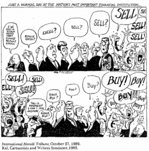
1. Be careful buying when the crowd is excessively bullish or selling when the crowd is excessively bearish. Even when the crowd is correct, excessive sentiment in one direction or another can delay a move.

ts-donc-01-buysell

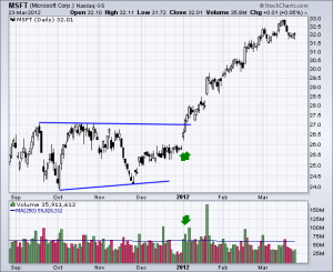
2. When prices trade in a narrow range with little volatility, look for a volume increase to confirm the direction of the next move. Subsequent strength on higher volume is bullish, while subsequent weakness on higher volume is bearish.

ts-donc-02-msft-range

3. Let your profits run and cut your losses short. This guideline overrides any other guideline.

4. Trade in smaller amounts during times of uncertainty. Trading losses and whipsaws can be reduced by focusing on solid setups and robust signals.

5. Do not chase a position after a three day move. Wait for a one-day reversal to improve the risk-reward ratio.

6. Use a stop-loss to limit losses and protect accrued profits. Stop-losses should be based on the trading pattern at work. A triangle pattern will have a different stop-loss structure than a rising wedge or head-and-shoulders pattern. 7. Due to the law of percentages, long positions should be larger than short positions during a broad uptrend. This assumes that the upswings will be larger than the downswings as a series of rising peaks and troughs evolves. A short position on a decline from 50 to 40 would produce a 20% profit, but a long position on an advance from 40 to 50 would produce a 25% profit. The percentage gain on advances will be greater and the trading amount should also be greater.

8. Use limit orders when initiating a position. Use market orders when closing a position.

9. Buy securities that are in uptrends and show relative strength. Sell securities that are in downtrends and show relative weakness. These two guidelines are subject to all other guidelines.

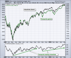
10. A broad market advance is more likely to continue when transportation stocks lead (Dow Transports). A broad market advance is suspect when transportation stocks lag.

ts-donc-03-tranlead

11. A security’s capitalization, its activity level in the marketplace and its trading characteristics are just as important as its fundamentals. (The interpretation of this guideline is rather difficult because it is unclear what Donchian means with “capitalization”).
Nine Technical Guidelines

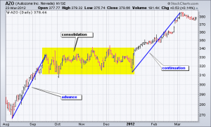
12. A consolidation or sideways trading range after an initial advance often leads to another advance of equal proportions. After this second advance, chartists can expect a counter move and decline back towards the consolidation. Similarly, a consolidation or sideways trading range after an initial decline often leads to another decline of equal proportions. After this second decline, chartists can expect a counter move and advance back towards the consolidation.

ts-donc-04-azo-consol

13. A long sideways consolidation after an advance marks future resistance. Expect resistance or a bearish reversal when prices decline and then return to this level. A long sideways consolidation after a decline marks future support. Expect support or a bullish reversal when prices advance and then return to this level. 14. Look for buying opportunities when prices decline to a trendline on average or low volume. Conversely, look for selling opportunities when prices advance to a trendline on average or low volume. Be careful if prices stall around the trendline (hug) or if the trendline has been touched too often.

15. Prepare for a bearish trendline break when prices decline to a rising trendline, fail to bounce and subsequently crawl along the trendline. Prepare for a bullish trendline break when prices advance to a falling trendline, hold most of their gains and crawl along the trendline. Repeated bumping of a trendline also increases the chances of a break.

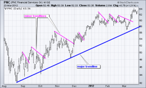
16. Major trendlines define the longer trend. Minor trendlines define the shorter trend. When prices are above a major trendline (rising), use minor trendlines (falling) to define short pullbacks and generate buy signals with upside breaks. When prices are below a major trendline (falling), use minor trendlines (rising) to define short bounces and generate sell signals with downside breaks.

ts-donc-05-pnc-trendlines

17. Triangles are usually broken on the flat side. This means an ascending triangle is usually broken with an upside breakout, while a descending triangle is usually broken to the downside. Chartists must look for other clues to determine if a triangle signals accumulation or distribution.

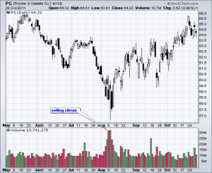
18. Look for a volume climax to signal the end of a long move. An extended advance sometimes ends with a volume surge that marks a blow-off . Conversely, an extended decline sometimes ends with a volume surge that marks a selling climax.

ts-donc-06-pg-climax

19. Not all gaps are filled. Breakaway gaps signal the start of a new trend and are not filled. Continuation gaps mark a continuation of the existing trend and are not filled. Exhaustion gaps mark a trend reversal and are filled. Chartists should not count on a gap being filled unless they can determine what kind of gap it is, which is easier said than done.

20. During an advance, initiate or add to long positions after a one day decline, no matter how small the decline and especially when the decline is on lower volume. During a decline, initiate or add to short positions after a one-day advance, no matter how big the bounce and especially if the bounce is on lower volume.

Conclusions

At least three themes emerge from these rules. First, direction of the underlying trend determines position preference. Chartists should focus on long positions during an uptrend and short positions during a downtrend. Second, volume plays an important part in the analysis process. Price moves in the direction of the bigger trend should be on higher volume, while counter trend moves should be on lower volume. However, note that volume climaxes can mark the end of an extended move. Third, trading ranges and consolidations are important chart patterns. Long consolidations can mark reversals and future support or resistance levels. Short consolidations often mark a rest in the ongoing trend.

Views – 235

Trend Composite Indicator

Long-term trend reversals are often processes, not sudden events. Think of the long-term trend as a super tanker, which requires time to reverse direction. Speedboats, on the other hand, represent the short-term trend, which can quickly reverse. Moreover, the long-term trend can range from several months to a few years. With this in mind, chartists should consider more than one long-term timeframe when defining the long-term trend. This article will show how to use an array of moving averages to define the long-term trend and identify the trend reversals with fewer whipsaws.

1.  Moving Averages

Despite their lag, moving averages are probably the most popular indicator for trend identification. Chartists often look at price levels relative to a specific moving average. The trend is considered up when prices are above a particular moving average and down when below a particular moving average. If only it were that easy.

ts-trend-01-spy-mova

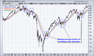
The chart above shows the S&P 500 ETF (SPY) with four long-term exponential moving averages (EMAs). Chartists can define the trend by comparing the price level to the :

  • 125-day EMA,
  • 150-day EMA,
  • 175-day EMA and
  • 200-day EMA.

However, the trend does not always reverse when prices move above or below these moving averages. There was a clear downtrend from the 2007 high until the March 2009 low, but SPY broke above these moving averages at the end of 2007 and again in the first half of 2008. These breakouts did not signal a trend reversal because the ETF soon peaked and continued lower. After this downtrend, there was an extended uptrend from March 2009 to April 2012. Again, the ETF broke below these moving averages in 2010 and again in 2011. These breaks did not signal a trend reversal because the ETF quickly recovered and continued higher.

Smoothing the Closing Price

As evidenced on the chart above, daily price data can be quite volatile and this means moving average breaks are prone to false signals. A long-term trend identification system should be able to capture the long-term trend without so many whipsaws (false signals). It is impossible to totally eliminate whipsaws, but chartists can reduce them by smoothing the price data and then using the long-term moving averages.

ts-trend-02-dia-50ema

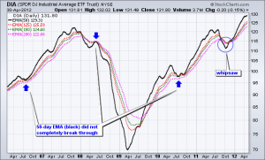
The chart above shows the Dow Industrials SPDR (DIA) as a 50-day EMA (black). Four exponential moving averages are also shown to define the trend. Note that the actual price plot for DIA is invisible on this Sharpchart so we can focus on the smoothed 50-day EMA for signals. Smoothing the price data with a 50-day EMA increases the lag factor, but it also decreases the number of whipsaws. The blue arrow shows where DIA held the moving averages and maintained the trend. The blue circle shows a whipsaw towards the end of 2011. Compared to the SPY chart above, there were fewer whipsaws and this system did a better job of trend identification.

2.  Using the Percent Price Oscillator

Chartists can also use the Percent Price Oscillator (PPO) to determine if the 50-day EMA is above or below a long-term EMA. The Percent Price Oscillator set at (50,200,1), for example, measures the percentage difference between the 50-day EMA and 200-day EMA. The PPO is positive when the shorter EMA is above the longer EMA and negative when the shorter EMA is below the longer EMA. This indicator makes it easy to identify moving average crossovers.

ts-trend-03-spy-ppo

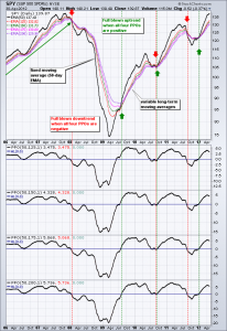
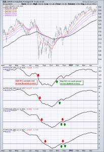
The chart above shows four versions of the Percent Price Oscillator (PPO) comparing the 50-day EMA to longer EMAs. The trend is strong and bullish when all four PPOs are positive. The trend slowly weakens as they turn negative and the trend is full blown bearish when all four are negative. In this regard, the trend is unlikely to fully reverse overnight. Instead, a trend reversal is a process that will usually take a few weeks.

3.  Fixing the Long-term EMA

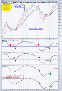
The example above uses a fixed medium-term exponential moving average (50-day EMA) and variable long-term EMAs. Chartists can also fix the long-term EMA and make the shorter EMAs variable. For example, the long-term EMA could be fixed at 150 days and the other EMAs could scale up in equal increments. The chart below shows four Percent Price Oscillators with a fixed long-term EMA (150 days) and four variable EMAs (20, 40, 60 and 80 days).

ts-trend-04-mdy-ltfixed

Chartists can use positive and negative readings to assess the trend. The Percent Price Oscillator (20,150,1) will be the most sensitive and the first to change, while the Percent Price Oscillator (80,150,1) will be the least sensitive and the last to change. Chartists can then quantify trend direction and strength based on the number of indicators in positive or negative territory. Again, the trend is full blown bullish when all four PPOs are positive and full blown bearish when all four are negative.

4.  Asset Allocation

Many investing strategies scale into positions as the evidence turns bullish and scale out as the evidence turns bearish. Chartists can use these four Percent Price Oscillators (PPOs) to develop a scaling system based on a strengthening trend or a weakening trend. For example, the four PPOs could represent one quarter of the trend and one quarter of the portfolio allocation. When one PPO turns positive and the trend is one quarter bullish, investors could invest 25 percent in the stock market. The second tranche could be invested when a second PPO turns positive and so forth. An investor would be 100 percent invested by the time all four are in positive territory

ts-trend-05-dia-alloc

In a similar fashion, an investor could reduce long positions by 25% when the first PPO turns negative. Market exposure would be subsequently reduced as the other PPOs turn negative and an investor would be out of the market when all four are negative.

5.  Indicator Tweaks

Chartists can use other indicators to define the trend and determine asset allocation. For example, the slope indicator can be used in the same manner, though chartists will most likely wish to adjust the timeframe.

The example below shows the S&P 500 ETF with four versions of the slope indicator (50-day, 75-day, 100-day and 125-day). The trend is up when the slope is positive and down when the slope is negative. The degree of strength depends on how many slope indicators are positive. A strong uptrend is present when all four are positive, while a strong downtrend is present when all four are negative.

ts-trend-06-spy-slope

Conclusions

Trend identification is often the starting point for many trading and investing strategies. Relatively passive investors can use a long-term trend following strategy to define the trend and allocate funds accordingly. Active traders can use these trend indicators to define the long-term trend and then look for trades in the direction of that trend.

This article shows examples using long-term exponential moving averages and long-term settings for the Percent Price Oscillator (PPO). These settings can, of course, be tweaked to suit your trading or investing style. Keep in mind that this article is designed as a starting point for trading system development. Use these ideas to augment your trading style, risk-reward preferences and personal judgments.

Views – 256

Head and Shoulders Patterns

Head and Shoulders

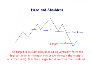
A head and shoulders pattern consists of a peak followed by a higher peak and then a lower peak with a break below the neckline. The neckline is drawn through the lowest points of the two intervening troughs and may slope upward or downward. A downward sloping neckline is more reliable as a signal.

The extent of the breakout move can be estimated by measuring from the top of the middle peak down to the neckline. This target is then projected downwards from the point of breakout.
patterns head and shoulders

Volume Confirmation

  • High volume on the first peak,
  • Moderate volume on the middle peak,
  • Low volume on the third peak, and
  • A sharp increase in volume on the break below the neckline.

Trading Signals

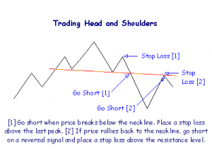
Go short at breakout below the neckline.
Place a stop-loss just above the last peak.

After the breakout, price often rallies back to the neckline which then acts as a resistance level. Go short on a reversal signal and place a stop-loss one tick above the resistance level.
head and shoulders trading

Never trust a head and shoulders pattern where the neckline is clearly ascending (the second trough being higher than the first). Also, the more level the neckline, the more reliable the pattern.

Inverted Head and Shoulders

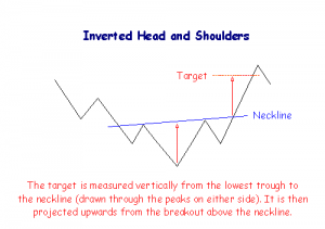
With inverted head and shoulders the neckline is drawn through the highest points of the two intervening peaks. A downward sloping neckline signals continuing weakness and is less reliable as a reversal signal.

The extent of the breakout move can be estimated by measuring from the top of the middle trough up to the neckline. This target is then projected upwards from the point of breakout.

patterns inverted head and shoulders

Volume Confirmation

  • High volume on the first trough,
  • Moderate volume on the second trough,
  • High volume on the second peak,
  • Low volume on the third trough, and
  • A sharp increase in volume at the breakout.

Trading Signals
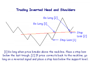
Go long at breakout above the neckline.

Place a stop-loss one tick below the last trough.

There is frequently a correction back to the neckline, which then acts as a support level. Go long on a reversal signal and place a stop-loss one tick below the support level.

inverted head and shoulders

Never trust an inverted head and shoulders pattern where the neckline is clearly descending (the second peak being lower than the first). The more level the neckline, the more reliable the pattern.

Views – 867

Trading Ranges
Trading ranges are also referred to as:

  • Ranging markets;
  • lines in Dow Theory; or
  • rectangles in short-term patterns.

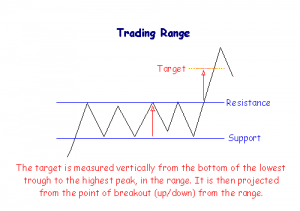
Bounded by support and resistance lines in close proximity, trading ranges signal distribution when they occur in an up-trend and accumulation in a down-trend. Price fluctuates within a narrow band, of 5% to 10%, with no clear trend.

Breakouts from a range can occur in either direction. A target for the move can be calculated by measuring the height of the trading range and projecting this upwards from the point of breakout (or downwards if there is a downside breakout).

patterns trading range

Volume Confirmation

Analysts often study the behavior of volume for clues as to the likely direction of a breakout. Volume should contract during the formation of the trading range and then expand on the breakout above or below the range. While the market is ranging, increased volume at peaks suggests an upward breakout, increased volume at troughs indicates a downside breakout.

Trading Signals

Breakouts are stronger signals when confirmed by volume.

Go long at a breakout above the trading range.

Place a stop-loss one tick below the bottom of the trading range.

There is frequently a correction back to the resistance level at the upper border of the trading range, which then acts as a support level. Go long on a reversal signal and place a stop-loss one tick below the support level.

Go short at a breakout below the trading range.

Place a stop-loss just above the upper border of the trading range.

Price often rallies back to the support level at the lower edge of the trading range. The support level then acts as a resistance level. Go short on a reversal signal and place a stop-loss above the resistance level.

Views – 634