Trend Composite Indicator
Long-term trend reversals are often processes, not sudden events. Think of the long-term trend as a super tanker, which requires time to reverse direction. Speedboats, on the other hand, represent the short-term trend, which can quickly reverse. Moreover, the long-term trend can range from several months to a few years. With this in mind, chartists should consider more than one long-term timeframe when defining the long-term trend. This article will show how to use an array of moving averages to define the long-term trend and identify the trend reversals with fewer whipsaws.
1. Moving Averages
Despite their lag, moving averages are probably the most popular indicator for trend identification. Chartists often look at price levels relative to a specific moving average. The trend is considered up when prices are above a particular moving average and down when below a particular moving average. If only it were that easy.
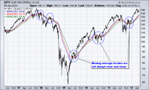
The chart above shows the S&P 500 ETF (SPY) with four long-term exponential moving averages (EMAs). Chartists can define the trend by comparing the price level to the :
- 125-day EMA,
- 150-day EMA,
- 175-day EMA and
- 200-day EMA.
However, the trend does not always reverse when prices move above or below these moving averages. There was a clear downtrend from the 2007 high until the March 2009 low, but SPY broke above these moving averages at the end of 2007 and again in the first half of 2008. These breakouts did not signal a trend reversal because the ETF soon peaked and continued lower. After this downtrend, there was an extended uptrend from March 2009 to April 2012. Again, the ETF broke below these moving averages in 2010 and again in 2011. These breaks did not signal a trend reversal because the ETF quickly recovered and continued higher.
Smoothing the Closing Price
As evidenced on the chart above, daily price data can be quite volatile and this means moving average breaks are prone to false signals. A long-term trend identification system should be able to capture the long-term trend without so many whipsaws (false signals). It is impossible to totally eliminate whipsaws, but chartists can reduce them by smoothing the price data and then using the long-term moving averages.
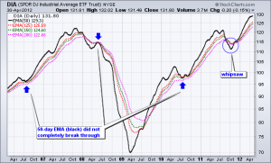
The chart above shows the Dow Industrials SPDR (DIA) as a 50-day EMA (black). Four exponential moving averages are also shown to define the trend. Note that the actual price plot for DIA is invisible on this Sharpchart so we can focus on the smoothed 50-day EMA for signals. Smoothing the price data with a 50-day EMA increases the lag factor, but it also decreases the number of whipsaws. The blue arrow shows where DIA held the moving averages and maintained the trend. The blue circle shows a whipsaw towards the end of 2011. Compared to the SPY chart above, there were fewer whipsaws and this system did a better job of trend identification.
2. Using the Percent Price Oscillator
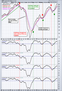
Chartists can also use the Percent Price Oscillator (PPO) to determine if the 50-day EMA is above or below a long-term EMA. The Percent Price Oscillator set at (50,200,1), for example, measures the percentage difference between the 50-day EMA and 200-day EMA. The PPO is positive when the shorter EMA is above the longer EMA and negative when the shorter EMA is below the longer EMA. This indicator makes it easy to identify moving average crossovers.
The chart above shows four versions of the Percent Price Oscillator (PPO) comparing the 50-day EMA to longer EMAs. The trend is strong and bullish when all four PPOs are positive. The trend slowly weakens as they turn negative and the trend is full blown bearish when all four are negative. In this regard, the trend is unlikely to fully reverse overnight. Instead, a trend reversal is a process that will usually take a few weeks.
3. Fixing the Long-term EMA
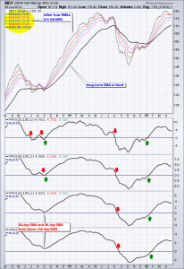
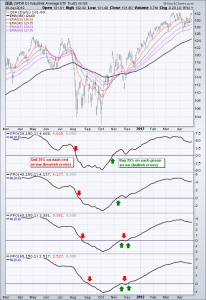
The example above uses a fixed medium-term exponential moving average (50-day EMA) and variable long-term EMAs. Chartists can also fix the long-term EMA and make the shorter EMAs variable. For example, the long-term EMA could be fixed at 150 days and the other EMAs could scale up in equal increments. The chart below shows four Percent Price Oscillators with a fixed long-term EMA (150 days) and four variable EMAs (20, 40, 60 and 80 days).
Chartists can use positive and negative readings to assess the trend. The Percent Price Oscillator (20,150,1) will be the most sensitive and the first to change, while the Percent Price Oscillator (80,150,1) will be the least sensitive and the last to change. Chartists can then quantify trend direction and strength based on the number of indicators in positive or negative territory. Again, the trend is full blown bullish when all four PPOs are positive and full blown bearish when all four are negative.
4. Asset Allocation
Many investing strategies scale into positions as the evidence turns bullish and scale out as the evidence turns bearish. Chartists can use these four Percent Price Oscillators (PPOs) to develop a scaling system based on a strengthening trend or a weakening trend. For example, the four PPOs could represent one quarter of the trend and one quarter of the portfolio allocation. When one PPO turns positive and the trend is one quarter bullish, investors could invest 25 percent in the stock market. The second tranche could be invested when a second PPO turns positive and so forth. An investor would be 100 percent invested by the time all four are in positive territory
In a similar fashion, an investor could reduce long positions by 25% when the first PPO turns negative. Market exposure would be subsequently reduced as the other PPOs turn negative and an investor would be out of the market when all four are negative.
5. Indicator Tweaks
Chartists can use other indicators to define the trend and determine asset allocation. For example, the slope indicator can be used in the same manner, though chartists will most likely wish to adjust the timeframe.
The example below shows the S&P 500 ETF with four versions of the slope indicator (50-day, 75-day, 100-day and 125-day). The trend is up when the slope is positive and down when the slope is negative. The degree of strength depends on how many slope indicators are positive. A strong uptrend is present when all four are positive, while a strong downtrend is present when all four are negative.
Conclusions
Trend identification is often the starting point for many trading and investing strategies. Relatively passive investors can use a long-term trend following strategy to define the trend and allocate funds accordingly. Active traders can use these trend indicators to define the long-term trend and then look for trades in the direction of that trend.
This article shows examples using long-term exponential moving averages and long-term settings for the Percent Price Oscillator (PPO). These settings can, of course, be tweaked to suit your trading or investing style. Keep in mind that this article is designed as a starting point for trading system development. Use these ideas to augment your trading style, risk-reward preferences and personal judgments.
Views – 237

Recent Comments